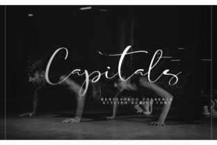
Capitals: A Handwritten Font That Elevates Web Design
When you spend your days designing digital experiences, you learn to spot a font that will actually perform before you ever drop it into a mockup. Some typefaces look stunning in a specimen sheet but fall apart on a live landing page. Others feel right from the first letterform. Capitals belongs to the second group. This fresh handwritten font brings a contemporary charm to screens without sacrificing the clarity that web projects demand. If you build websites, craft digital products, or design brand identities for online businesses, Capitals deserves a close look.
What Capitals Brings to Digital Design
Capitals is a script font rooted in natural handwriting, but it avoids the overly casual or rustic look that sometimes makes handwritten typefaces feel out of place on professional websites. Instead, it strikes a balance between personality and polish. The strokes feel fluid and intentional, with a modern rhythm that suits both bold hero sections and subtle decorative accents. The letterforms carry a light, airy quality that works well on screens, where heavy or ornate scripts can quickly become distracting. For web designers who need to inject warmth and human touch into a layout, Capitals delivers that tone without veering into novelty territory.
The font sits comfortably in the Script Amp category, meaning it is designed to amplify visual interest while remaining legible in digital contexts. That distinction matters when you are choosing type for a conversion-focused layout. A script that looks beautiful but causes visitors to pause and squint will hurt engagement. Capitals reads naturally, even at moderate sizes, which makes it a reliable tool for everything from a boutique store banner to a course sales page headline.
Where Capitals Shines in Web Layouts
Not every font should do every job. Capitals is not a body copy workhorse, and it does not pretend to be. It excels in roles where you want to draw attention, set a mood, or reinforce brand character. Here are the digital applications where I have found Capitals to be most effective.
Hero Sections and Headers
The most immediate use for Capitals is in website headers and hero sections. A single word or short phrase set in this font instantly signals a brand that values creativity and approachability. I used Capitals recently for a coaching website where the hero read, simply, Grow. The handwritten feel made the message feel personal, as if the coach herself had written it. Paired with a clean sans serif font for the tagline and navigation, the layout felt both warm and professional. The font held up well across screen sizes, from a 27-inch monitor down to a phone held in portrait mode.
Call-to-Action Buttons and Accents
One of the more surprising uses for Capitals is inside call-to-action buttons. Because the font carries a human, friendly tone, it can soften the hard sell that sometimes accompanies CTAs. A button that reads Join Now or Get Started in Capitals feels more like an invitation than a command. That subtle shift in tone can improve click-through rates on landing pages and product pages. I have also used Capitals for pull quotes, testimonial highlights, and short promotional banners. In each case, the font adds a layer of authenticity that standard sans serif typefaces cannot replicate.
Online Shop Banners and Product Headlines
For ecommerce stores, Capitals works beautifully in category banners and product name treatments. A boutique apparel shop could use Capitals to display a seasonal collection title like Summer Drops or New Arrivals. The handwritten style suggests a small, curated business rather than a massive retailer. That perception builds trust and encourages browsing. On product detail pages, Capitals can serve as a decorative accent for the product name while a more neutral sans serif handles descriptions and pricing. The contrast keeps the page scannable and visually engaging.
Readability and Responsive Considerations
Every web designer knows that a font that looks perfect on a desktop mockup can become illegible when the viewport shrinks. Capitals handles responsive design well, provided you follow a few practical guidelines. For mobile screens, I recommend using Capitals at a minimum size of 24px for short headings and 18px for button text. Below those thresholds, the handwritten strokes start to lose definition, especially on lower-resolution displays. If you need to display a longer phrase on mobile, consider switching to a simpler sans serif for that specific breakpoint and reserving Capitals for the largest heading on the page.
On dark backgrounds, Capitals benefits from generous letter spacing and a light color that contrasts sharply with the background. A pure white on a dark charcoal or navy backdrop works well. For light backgrounds, a deep charcoal or almost-black text color preserves readability while keeping the soft handwritten feel. Avoid using Capitals as an image overlay font unless the image has a consistent, low-contrast area behind the text. Busy or high-contrast images will fight the stroke details and reduce legibility.
Pairing Capitals with Other Fonts
A handwritten font rarely works alone in a digital layout. The best results come from pairing Capitals with a contrasting typeface that supports readability and reinforces the overall brand identity. The most reliable pairing is with a clean sans serif font for body copy, navigation, and secondary headings. Sans serif fonts like Inter, Work Sans, or Open Sans provide the neutral foundation that allows Capitals to stand out without competing for attention. The combination creates a clear visual hierarchy: the handwritten font draws the eye to key messages, while the sans serif handles the heavy lifting of paragraphs and interface labels.
For a more editorial or sophisticated brand look, consider pairing Capitals with a modern serif font. A serif typeface like Playfair Display or Cormorant Garamond can give the layout a magazine-quality feel while Capitals adds a personal, handwritten accent. This pairing works especially well for online magazines, portfolio websites, and creative agency pages. The key is to use Capitals sparingly, typically for the main title or a single decorative element, and let the serif font carry the rest of the typographic weight.
If you are building a digital brand kit, include Capitals as the display font for headlines, logo lockups, and hero messages. Then select one workhorse sans serif and one secondary font for supporting roles. That three-font system gives you flexibility across landing pages, blog posts, email headers, and social media graphics without creating visual chaos.
Capitals in Specific Digital Projects
To make the discussion concrete, here are three project types where Capitals delivers strong results.
- Creative portfolio sites. A designer or photographer can use Capitals for the site name and project titles. The handwritten quality reflects a personal brand and helps the portfolio feel like a curated gallery rather than a template. Pair it with a lightweight sans serif for project descriptions and contact information.
- Boutique online stores. Small product catalogs benefit from the warmth Capitals brings. Use it for collection names, sale announcements, and the brand tagline. Keep product descriptions and pricing in a high-readability sans serif to avoid cognitive friction during the buying decision.
- Course and membership pages. If you design sales pages for digital courses or membership sites, Capitals can humanize the offer. A headline like Design Your Future in Capitals sets an aspirational tone. Below it, a clean sans serif explains the curriculum and pricing. The contrast helps visitors connect emotionally while still processing the practical details.
File Formats and Licensing for Web Use
Before you commit to Capitals for a client project or your own website, check the included file formats. Most premium fonts in this category offer both OTF and TTF files, which cover desktop design software and basic web use. For live web projects, you will need webfont formats such as WOFF and WOFF2. If Capitals includes these, you can self-host the font on your site, which gives you full control over loading performance and fallback behavior. If only desktop formats are included, you may need to convert the files or use a third-party service to serve the webfont version.
Commercial licensing is another essential consideration. Capitals, like all premium fonts, requires a proper license for use in commercial projects. If you are designing a website for a client, building an online store, or creating digital templates for sale, confirm that your license covers those specific use cases. Many foundries offer tiered licenses: a standard desktop license for print and static images, and a separate webfont license for live websites. Failing to secure the correct license can lead to legal issues down the line and reflects poorly on your professionalism as a designer. Always read the licensing terms before publishing any project that uses Capitals.
Making Capitals Part of Your Typography Toolkit
Every web designer needs a handful of display fonts that can be counted on to perform across different brands, devices, and content types. Capitals deserves a spot in that shortlist. Its contemporary handwritten style brings a human element to digital spaces that often feel too polished or impersonal. When used deliberately, it can improve brand trust, support visual hierarchy, and make a layout feel more inviting without sacrificing the clarity that conversion-focused design requires.
Start by testing Capitals in a hero section or a call-to-action button on your next landing page. Adjust the size, spacing, and background to find the sweet spot where the font feels natural rather than forced. Then observe how visitors interact with that page. The right typeface not only looks good, it changes how people feel about what they are reading. Capitals has that potential. Use it where you want to connect, and let your other fonts handle everything else.